|
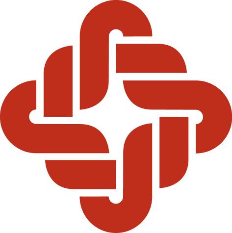
FEIB’s logo consists of four interlocking letter “F”s — for “Far Eastern”— combined into the shape of a traditional Chinese knot. Such knots symbolize many things to the Chinese, among them teamwork, cooperation and unity. So too do these words symbolize the Bank’s philosophy: the teamwork between management and staff; the cooperation of the Bank and its customers; the unity required from all layers of society if Taiwan is to continue to grow; even the inseparable relationship between performance and profits.
The shape of this particular knot is important as well. Its rounded, almost “windmill” shape represents a rolling, on-going forward momentum which further illustrates the confidence and aggressiveness with which FEIB pursues its business goals.
The logo is important part of the FEIB’s total identity program . It is the constant link that connects all aspects of FEIB into a visually unified whole, from signage and decoration through literature, stationery and our various Bank forms and documents.
 |